Making a catalogue of 20,000+ products easier to browse, understand and trust
Focus
Product discovery, trust, navigation, conversion
Client
Project Type
Ecommerce UX / Shopify / Marketplace Design
Role
UX design, visual design, content structure
MOCBoxing
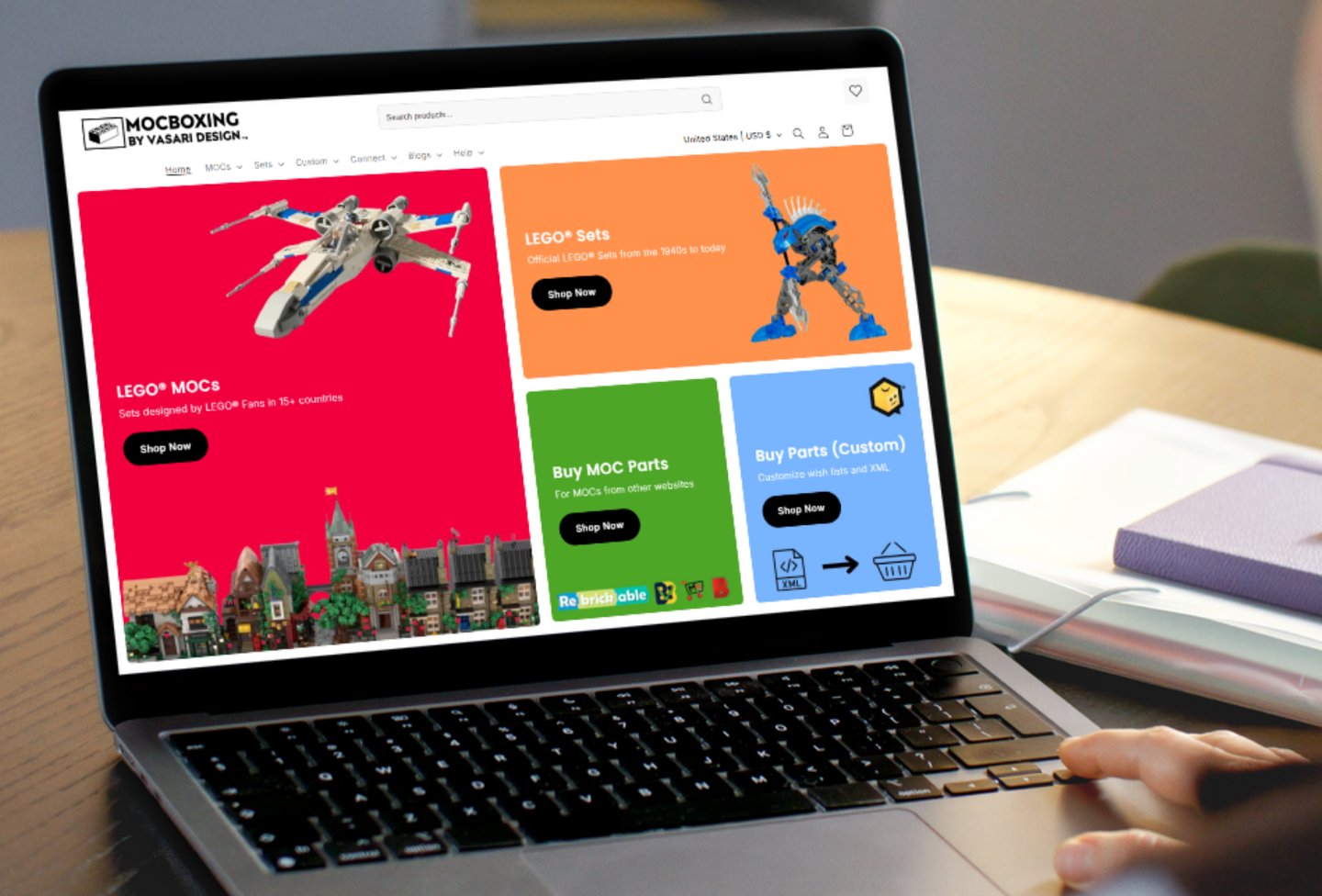
MOCBoxing had grown into a large specialist ecommerce marketplace, but the customer experience had not developed at the same pace.
I redesigned key parts of the website to create clearer routes into the catalogue, explain an unfamiliar buying process and build confidence before purchase. I also developed reusable page systems that could support new products, designers and campaigns as the marketplace continued to grow.
MOCBoxing had a growing catalogue of custom LEGO MOC kits, official sets, designers, and specialist product types. The website needed to help customers quickly understand what was being sold, how the buying process worked, and why purchasing through MOCBoxing was easier than sourcing parts manually.
The challenge was not simply making the site look better. It was making a niche ecommerce experience easier to navigate, easier to trust, and easier to buy from.
The business problem
Product discovery was unclear
01
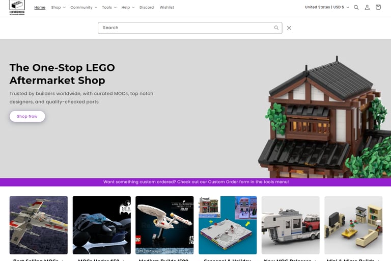
Customers had limited routes into a catalogue containing thousands of products. Unless they already knew the correct theme, designer or search term, it was difficult to know where to begin.
02
03
04
The offer needed explaining
Trust needed to appear earlier
The site needed to scale
Unlike a standard retail product, customers needed to understand what the kit included, where the instructions came from and how MOCBoxing differed from sourcing parts manually.
High-value specialist products created understandable concerns around part authenticity, delivery, support and order quality. Important reassurance was not always visible early enough.
New products, designers and categories were being added regularly. The website needed reusable systems rather than individually designed pages that would become difficult to maintain.
Where the experience started
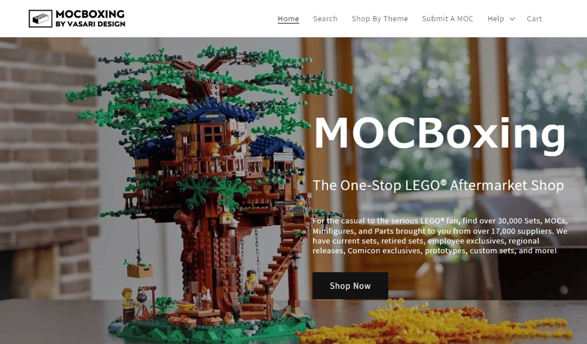
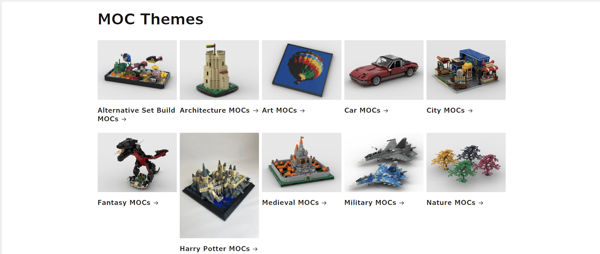
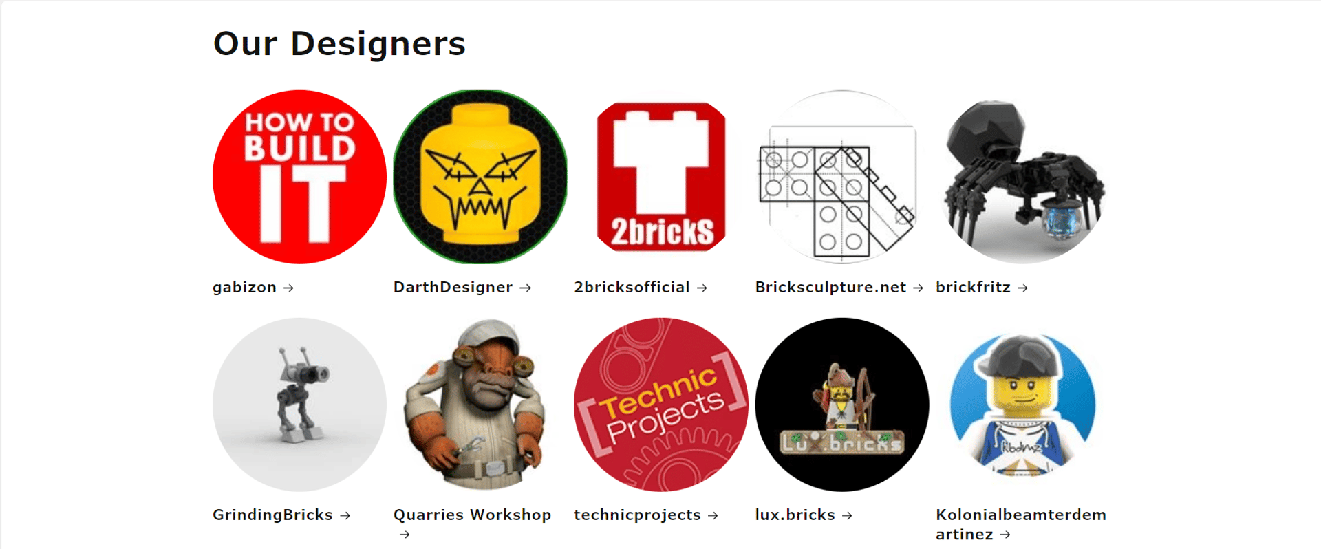
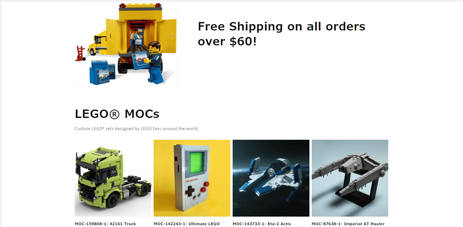
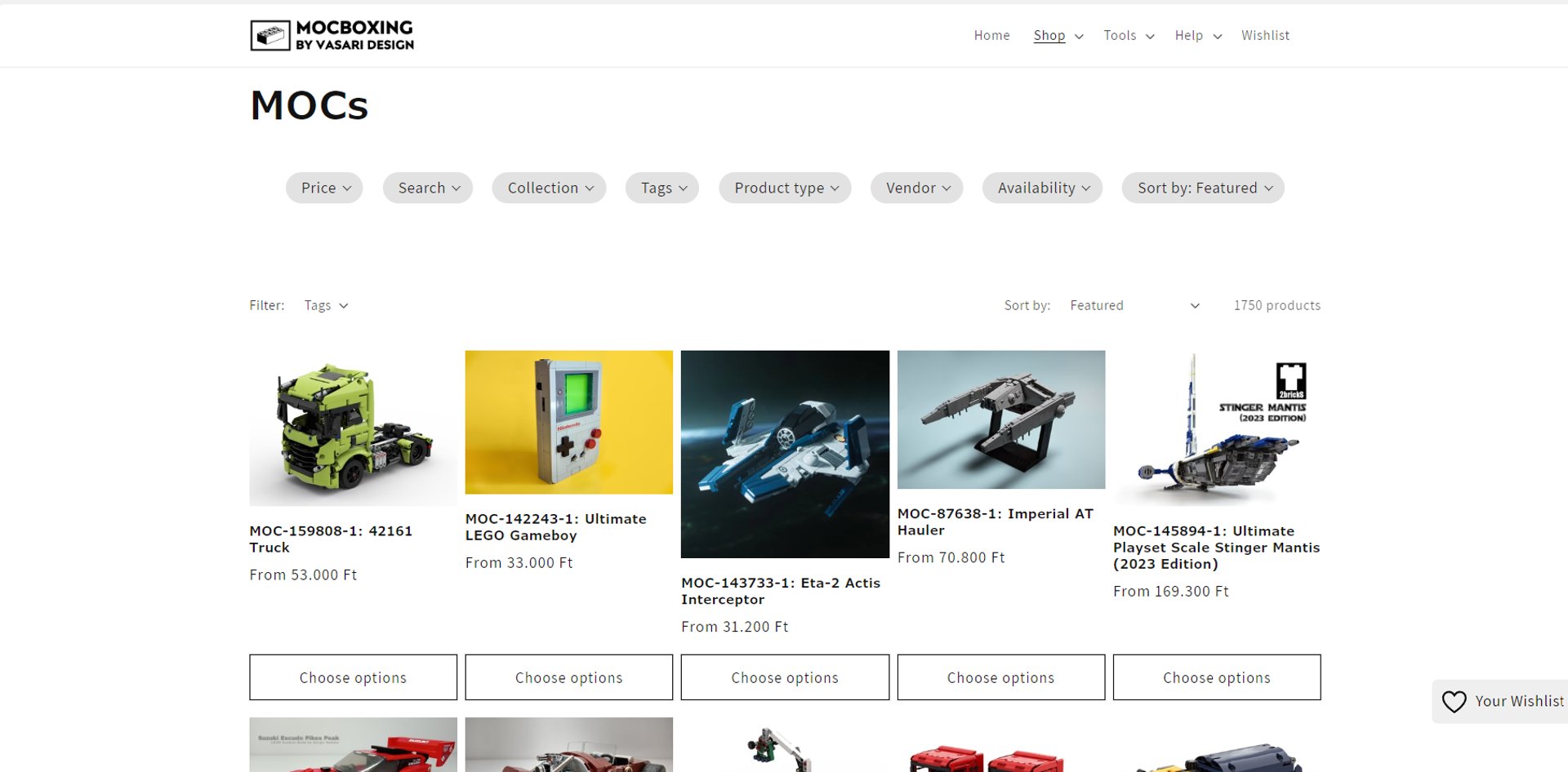
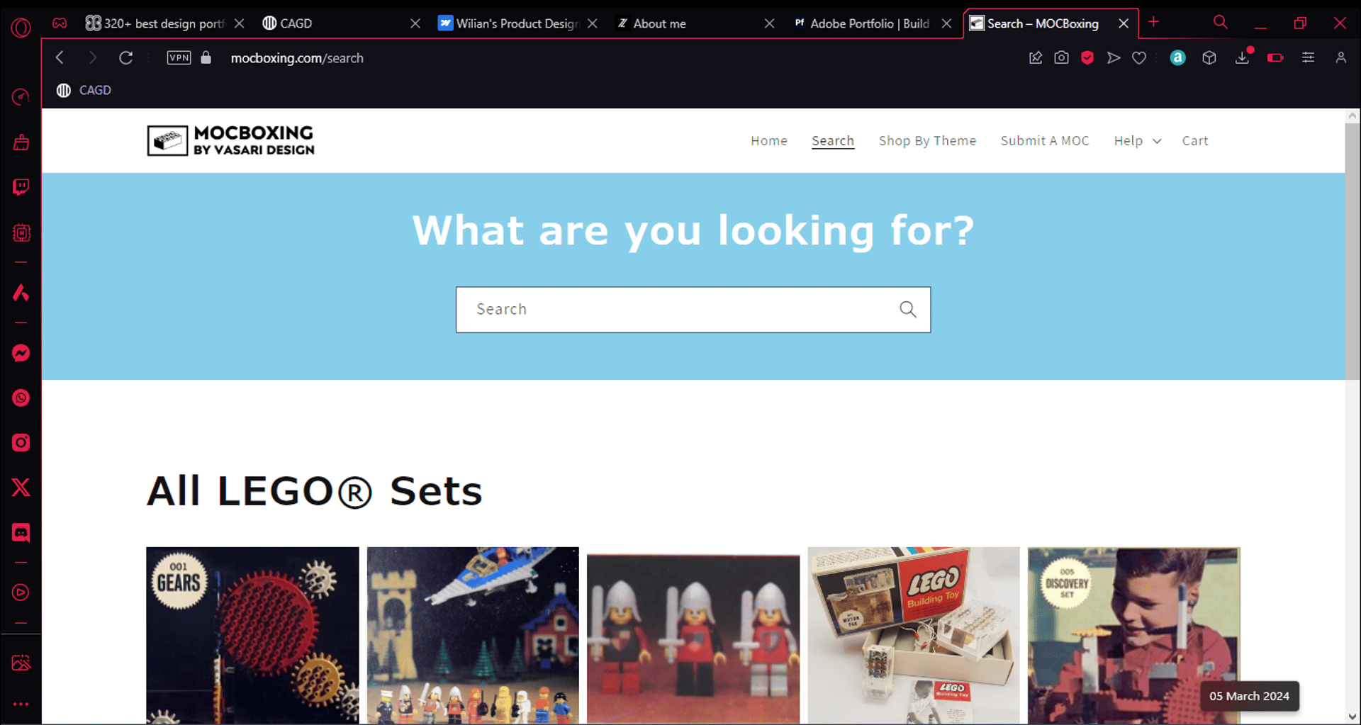
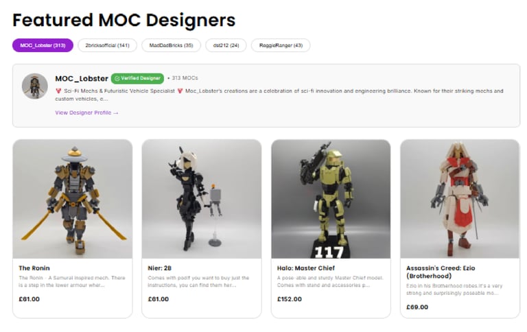
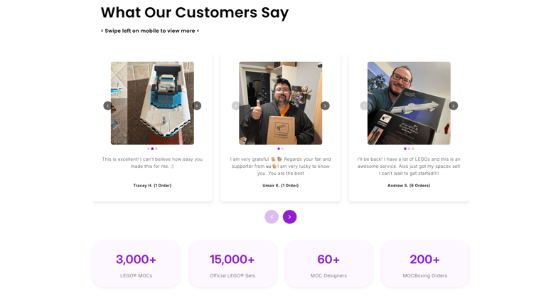
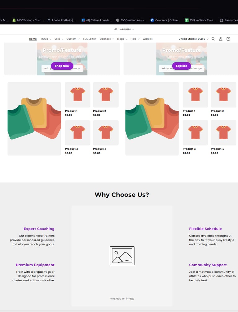
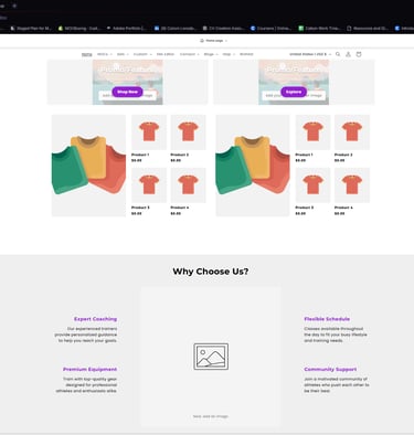
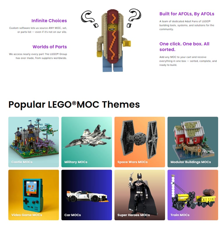
Created clearer routes into the catalogue
Problem
Customers were entering a catalogue of thousands of products without enough guidance on where to begin.
Design decision
I introduced more visible routes through themes, designers, featured products and curated collections.
Effect
Customers gained more ways to explore the catalogue without knowing an exact product name or search term. The structure also allowed MOCBoxing to promote different designers and product groups without redesigning the website each time.
What I Changed
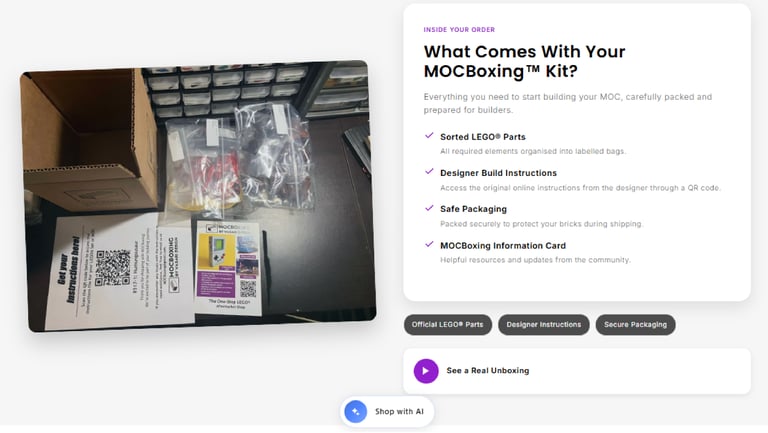
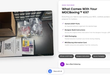
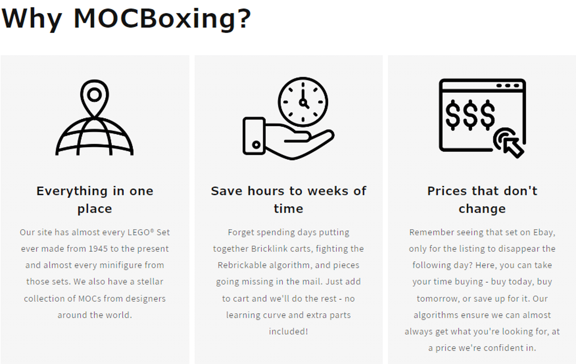
Explained the offer before purchase
Problem
Customers could not always immediately understand what they would receive or how the instructions worked.
Design decision
I created visual explanation sections covering sorted parts, designer instructions, packaging and supporting information.
Effect
The buying process became easier to understand before checkout, while MOCBoxing was positioned as a complete time-saving service rather than simply another parts seller.
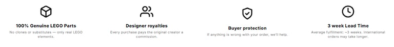
Brought reassurance earlier
Problem
First-time customers were being asked to spend significant amounts on a specialist product without enough immediate reassurance.
Design decision
I introduced concise trust messaging around genuine LEGO parts, designer royalties, buyer protection, customer support and delivery expectations.
Effect
Key customer concerns were addressed earlier in the journey instead of being left until product descriptions, help pages or checkout.
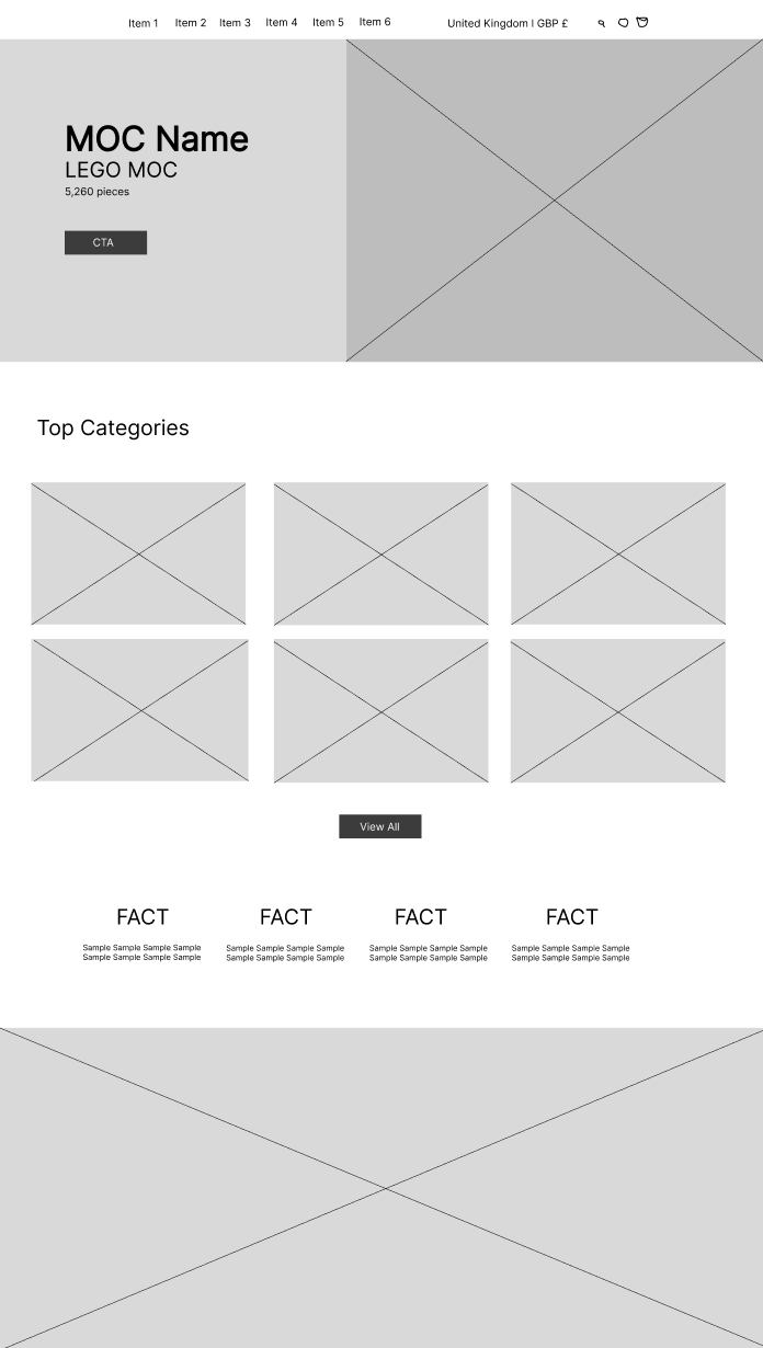
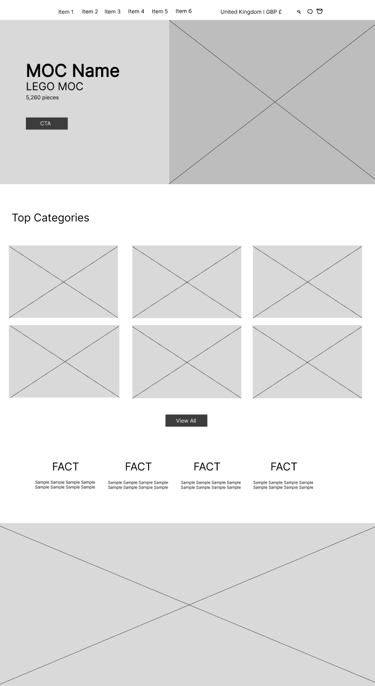
Wireframing the experience
Before refining the final page designs, I sketched and mapped out key sections to improve structure, hierarchy, and customer understanding. This helped me focus on what information needed to appear earlier, how users would move through the site, and how the catalogue could feel easier to browse.
The effect
The work helped turn MOCBoxing from a large product catalogue into a clearer ecommerce experience. Customers had more ways to browse, more explanation before purchase, and more reassurance around the buying process.
The site also gained a more scalable structure, making it easier to add new designers, product themes, campaign pages, and trust-focused content as the marketplace grew.
A clearer customer journey
A more scalable system for the business
A more understandable proposition
More routes into the catalogue through themes, designers, and featured product sections
Earlier reassurance around parts, delivery, support, and designer involvement
Reusable sections that could support future growth without rebuilding every page
Has your website become difficult to navigate or explain?
I help small businesses simplify complicated products, catalogues and customer journeys through clearer ecommerce design.